 It has been busy over here at Cooking is Messy because we got a new home! That’s right, it is now cookingismessy.com and I’m self-hosting my own site. Woot woot! I decided to make the switch because it is a shorter address, it allows me to have more space, and it gives me more control over design and content. For example, I now have a sweet plugin that will format the recipes so they are cleaner looking, easier to read, and easier to print. You can check out the updates here on the corn chowder post. I won’t gush too much now, I’ll save that for my next recipe post. Overall, I think the migration has gone pretty well. Some of the picture formatting has gotten wonky, so I’m working on it and it should all be cleaned up soon. But most importantly, enjoy the new Cooking is Messy home!
Now on to the Tate Modern. Last week I went to have lunch with Ryan and it was a beautiful day so afterwards I decided to take the a semi-long walk over the Thames and on to the Tate to check out some art. The museum is huge, so I can’t truly write about the whole thing but I’ll tell you about some of the things that I liked best. (Sorry for the iPhone pictures)
When I arrived, I was a little tired from the walk so I stretched out on the lawn outside the museum. It was lovely, sunshine on my face, grass between my toes, and ample people watching to be had.
The Tate is free, but to get a map they ask you to pay a little bit. I put some money in the tin and the security guard came over and said, “thank you for your contribution.” I was a little surprised, but probably he stands there all day and sees people just take the maps.
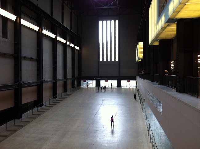
Since school has just started and tourist season is over it wasn’t very crowded. But, I think even if it was crowded, it might be ok because the space looks cavernous. It was nice to get to walk around, look at whatever I wanted, and not be squashed.
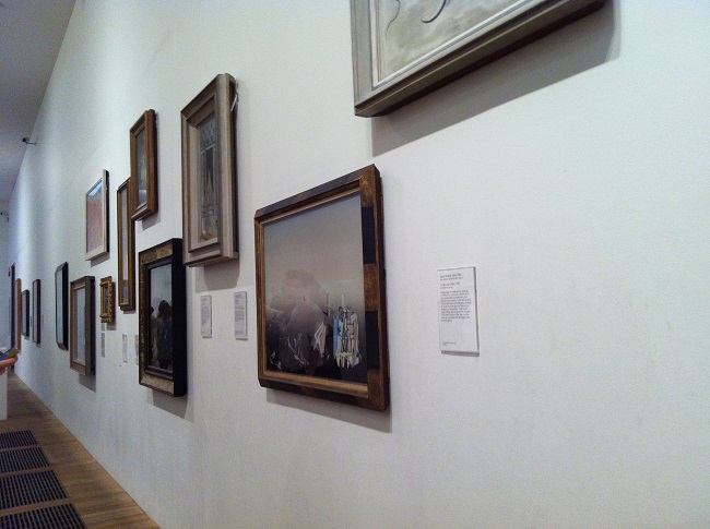
I loved the feel of the museum! I liked that it was full of other people so it didn’t feel lonely, but wasn’t too crowded. And I really liked the playful ways the museum displayed the art. Look at the how the frames are close together and a little uneven, but still visually appealing.
Now you might be thinking, “Mariel, stop all your museum talk. Who cares about how paintings are hung?” But take a moment and think about your last visit to an art museum. It probably had pristine and painfully white walls with about three paintings on a giant wall. Can you picture that? Doesn’t that seem a bit cold? Whereas this feels a bit homey. It feels like how I might want to hang my art and family portraits on my own walls.
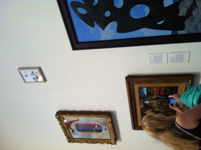
Also just look at this tiny picture hung up high. It’s amusing.
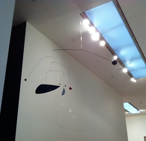
I also saw an Alexander Calder mobile. At the time I had just finished updating a lesson plan for Live It Learn It about sculpture and Alexander Calder. It was cool to get out of my own head and see, in person, what I had been writing about. Why is a mobile cool? I’ll tell you what I wrote in the lesson plans. He was the first to make sculptures come from the ceiling, not the floor. Also his sculptures move, and because of the wind, not because of any mechanics.
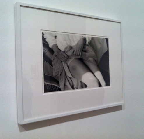
I particularly liked a gallery called Poetry and Dream with photographs by Henry Wessel. They were photos he took of ordinary moments of strangers – basically things he saw from a car or walking around. It was cool and a different way to notch up people watching. In my head I like creating stories about the people I see around me, and these photos seemed like a different way of doing that. Below is my favorite one in the series. It is provocative and surprising and a strange thing for a stranger to show someone else.
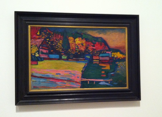
My favorite thing I saw was Wassily Kandinsky’s painting called Lake Starnberg. Kandinsky is probably my favorite painter. I love the use of bold colors on everyday scenes. I like that it both looks bright but not quite cheery. And I love the abstract, rounded, and clear brushstrokes. Just love it.
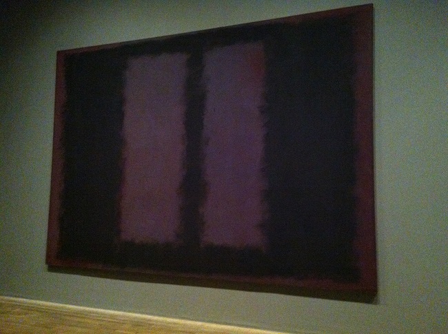
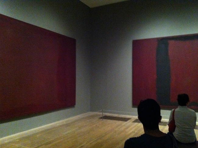
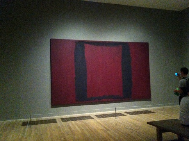
I also spent a lot of time in a room full of Rothko’s. My photos do not do the room justice. The paintings were a series of black and maroon paintings. I sat in the middle of the room on a big wooden bench and absorbed it. The room felt calm and serious, but not sad. I know Rothko is one of those painters that people often see and think, “that’s just color.” But I like that. I like that color can make a room have a mood for a feeling.
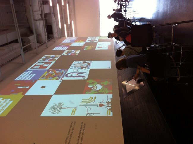
Perhaps one of the best things I saw was this interactive wall. It’s cool that an art museum asks for feedback and reflections through art! Visitors can submit their drawings and writing about the museum and then have them displayed above on the wall. This is awesome! Not only is the museum getting visitor feedback, but visitors get to feel like artists by having their work displayed. Seriously, what could be better than having your own work on the wall of an internationally acclaimed art museum!?



I have to agree with you that musuem looks great. I like to mobile, the challange of getting the right balance so that all of the parts work together.